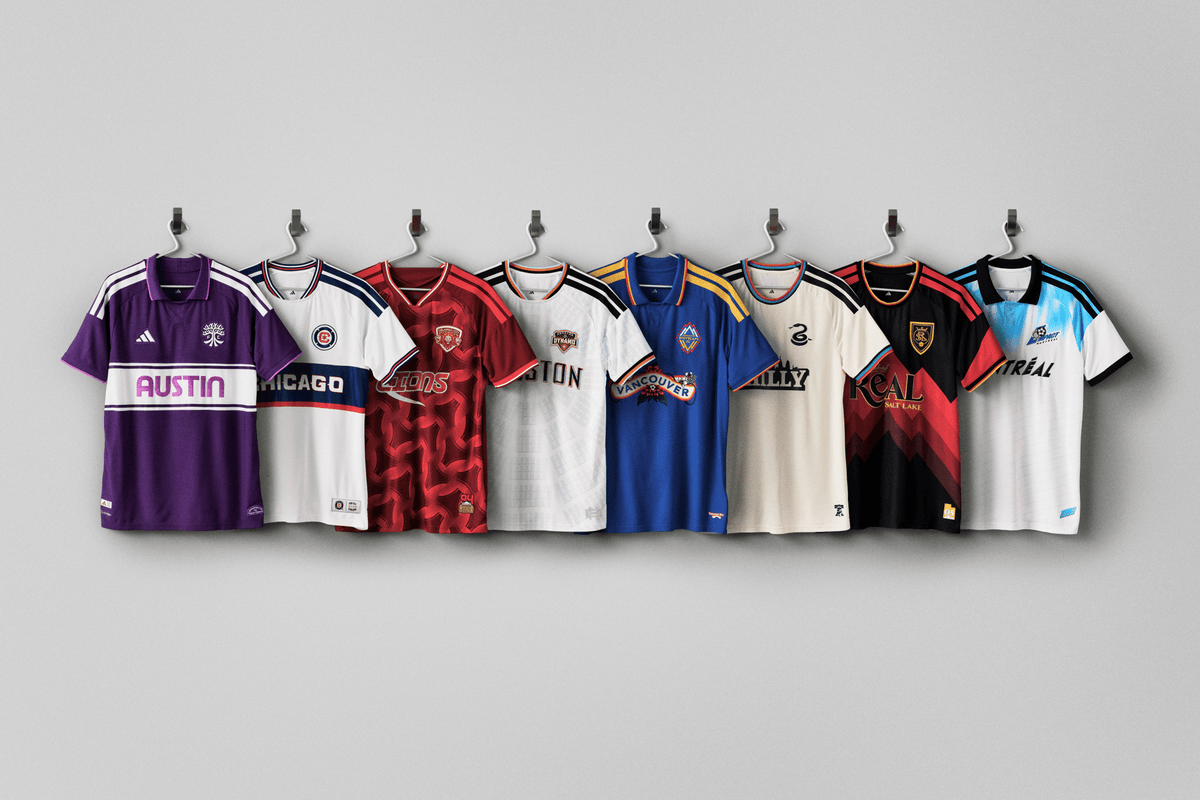
Year three of the MLS Archive Collection adds retro-inspired alternate kits for eight clubs across the league: Austin FC, CF Montreal, Chicago Fire, Houston Dynamo, Orlando City, Philadelphia Union, Real Salt Lake and Vancouver Whitecaps. These kits will be worn during the remainder of the 2026 season.
“The final Archive drop is a nod to the roots of MLS culture, giving fans kits that feel nostalgic while capturing the true spirit of the eight cities that have played an important part to cultivate the fandom around soccer culture,” said Griffin Claes, Adidas’ senior designer, club and MLS. “We didn’t design these to just be third jerseys, they are pieces for fans to rep the authentic energy, landmarks and pride of their home cities whether they’re in the stands or out in their communities.”
Let’s take a look at each design.
Austin FC
Brooks: This one has a strong retro vibe and I like the “Austin” font. I’m not against the purple, which is meant to represent the “iconic sunset glow that’s defined the city for over a century,” according to the MLS press release. But the shorts and socks that complete this kit are the same “Violet Crown” and that’s just a lot of purple. You’re now in Grimace and Barney the Dinosaur territory with all that.

Ilie Sánchez in the full Grimace. (Photo courtesy of MLS)
Meg: I just Googled what an Austin sunset looks like for journalism purposes, and now I very much get the reference. To your point, Brooks, the full purple look is a lot. I wish they had leaned into a color combo a little more. Trying to use the sunset for a secondary accent color would have still been too much, but this purple with a cream/off-white to balance it out would have been elite.
CF Montreal
Brooks: The Impact made their pro debut in 1993 and the vibes here are definitely of that time. I like the throwback Impact logo, but I kind of wish they took the blue tie-dye effect a little further down the shirt.
Meg: Am I still annoyed over the New England Revolution getting an Archive kit last year and refusing to use their original badge (RIP “crayon flag”)? Yes. So I am mighty relieved this year to see that everyone else is totally normal about using old crests in the proper manner.
What I am sort of baffled by is teams using away looks as the inspiration for these archive kits. Per the MLS release, this one “throws it back to 1993, when the Montréal Impact played their first pro game away from home.” I guess I get the first game ever appeal, but sometimes the struggle of walking the line between homage and full on retro gets exposed. The originals were way more interesting visually, with the Adidas stripes getting in the way on the Archive kit.
Chicago Fire
Brooks: This is a pretty faithful reproduction of the 2000 Fire away shirt. It’s nice, but a reimagined throwback would’ve been more fun. Plus the year 2000 wasn’t that long ago and shouldn’t be considered for an Archive collection… right? Please tell me the year 2000 wasn’t that long ago.
Meg: We’re old BUT we’re also the target demo for these. So you win some, you lose some. It’s a white kit, but again, bringing back the OG branding always helps. I’d also argue the current home and away kits for Chicago are both awful, so the third immediately becomes the best option of the season.
Houston Dynamo
Meg: Before I read the jersey explainer (because some of these really do need explainers to spell out the lore, if you are not a longtime fan of a specific club), I thought the pattern across the shirt was of an actual archive from above, with rows of shelves and books across it. It’s actually the Astrodome roof. Whoops. It’s a step up from a white shirt, but again, the specificity of feeling that the older crests evoke helps sell these more basic options.
Brooks: Yeah, once spelled out I can see the Astrodome roof design, but at first glance I was getting more “amphitheater seating chart.” A little too bland and, aside from the badge, doesn’t really give off a retro vibe.
Orlando City
Meg: Color! Thank you, Orlando. This is also one where I think a club has really nailed the thoughtfulness of a design, picking elements across multiple decades to create something that feels authentic to the city. My favorite element might actually be the pattern, pulled directly from Adidas Questra soccer ball. There are USL-era Orlando nods here. as well. Definitely in the top three of this year’s archive offerings for me.
Brooks: Yeah, I like this one a lot. The Lions were Orlando’s first soccer team. The Questra design as a reference to Orlando hosting ‘94 World Cup matches is an inspired choice and well executed. And the vibrant reds as worn by the club’s first USL title winners is a great bit of team history (that I’m kind of surprised MLS is on board with).
Philadelphia Union
Meg: I’m not sold, but I’m gonna let the Pennsylvania guy handle this one. I’ll admit though, I’m really surprised at how underwhelming this Philadelphia Union offering is, though. The press release says the kit is a throwback to the ‘90s, but… show your work, Union! Show your work!
Brooks: Yeah, this one is a let down, as someone from Philly. The city and the club have so many interesting visuals to work with and all we get here is a cream shirt with the skyline and the colors of the city’s other sports teams squeezed in on the collar and cuffs. That said, this shirt is a blank canvas for true Philly customization via dropped soft pretzels covered in mustard and oozing cheesesteaks. It’ll take some DIY, but after a couple of wears these shirts will have some more character.
Real Salt Lake
Meg: RSL is going for vintage ski vibes with their jersey drop, and I’m here for it, although I would not have known that was the inspiration for it at first glance. Shooting the release video in a ski cabin is a nice touch, though. Elite color combination, with the yellow gold really making this one feel premium in the approach. Another top three contender for me.
Brooks: Mountain motifs usually produce good results when used in kit designs and this is no exception. The colors and design work great together. If I was an RSL fan this would be an instant buy.
Vancouver Whitecaps
Meg: Nothing this year hits the heights of last year’s offering from Minnesota, but my first look at the collection overall had me immediately focusing on Vancouver. It is a relatively simple approach, compared to Orlando’s or Salt Lake’s, but there’s something about these colors together that scratched a very specific part of my brain and also hits on ‘90s/’00s design themes, when teams weren’t afraid of color. If I had any reason whatsoever to add a Vancouver Whitecaps jersey to my collection, I’d definitely be thinking about buying this one. Top three, and maybe the winner by an inch over Orlando.
Brooks: The Vancouver ‘86ers had some excellent kits back in the day and this does a solid job of invoking the spirit of them. The centerpiece of the shirt, with the pacific dogwood (the official flower of British Columbia) is lovely and kind of reminds me of a beer label… in a good way.
Meg’s top 3:
- Vancouver Whitecaps
- Orlando City
- Real Salt Lake
Brooks’ top 3:
- Real Salt Lake
- Vancouver Whitecaps
- Orlando City
Meg: Wow, consensus for the most part again!
Brooks: Last year we had the same top two and this year we’re three for three — albeit in a completely different order. Congrats to those three clubs on stellar archiving.