Connect with us

Sports

Ranking every 2026-27 Premier League home kit: Perfect pinstripes, a horror sponsor and one just like the sweater from Friends

Published

on

We’ve had at least two weeks without football, but now that barren, arid desert of nothingness is over and the new Premier League season is very nearly upon us.

And what better signpost for the coming campaign than the return of our traditional kit rankings. So roll up, roll up for your thoughts and opinions on the garms that your club will be wearing in home matches over the next 10 months.

Which shirt looks like a prop from Friends? Which is the equivalent of Homer Simpson backing into the hedge? And which new arrival comes out on top…?


(Clive Brunskill/Getty Images)

Do you think that in their heart of hearts, in the cold light of day when they consider their work, even the person at Adidas who designed this shirt thinks it looks good? The blurb says it pays homage to their shirt from the start of the 1990s but that looked stupid and this one does too. You can see why they have tried something like this: a bit of variety is worth a go and it’s not a terrible idea to try a bit of extra colour, but it looks abysmal and there’s a solid chance that anyone who runs a bit too quickly wearing this will strobe as they go past you.

Photo:

(Clive Brunskill/Getty Images)

(Clive Brunskill/Getty Images)

(Edmund So/Eurasia Sport Images/Getty Images)

Well, if nothing else this puts paid to the automatic assumption that kits automatically look great without a sponsor. What’s going on here? It’s not true to suggest that this looks like a dodgy, knock-off kit you’d find on a market somewhere because these days, those all look pretty convincing. This looks like a dodgy, knock-off kit you’d find on a market somewhere about 20 years ago, somewhere far away and before the internet could tell you what the actual Chelsea kit is like. Despite the extensive and occasionally bizarre promotional campaign (hello Madonna and Gymskin dancing together, for some reason), the shirt is simply no good.

Photo:

(Edmund So/Eurasia Sport Images/Getty Images)

(Edmund So/Eurasia Sport Images/Getty Images)

(Chung Sung-Jun/Getty Images)

Hmmm. This ‘colour fades into a different one at the waist’ thing looked weird when Manchester United did it with red and black a few years ago, and it looks weird for City with blue and white now. Puma is at least using the right shade of blue for City and the white trim on the collar, cuffs and underneath the armpits works quite nicely… if only they hadn’t spoiled it with the fading thing. It’s the football shirt equivalent of Homer backing into the hedge.

Photo:

(Chung Sung-Jun/Getty Images)

(Chung Sung-Jun/Getty Images)

(Tony King/Getty Images)

This is a slightly curious case, because it looks exactly like a shirt that Toffs — the company that produced reproductions of very old shirts from the early 1900s and beyond — would have put out. That’s partly because it sort of is: the shirt is inspired by Hull shirts from the 1970s, even to the extent of using their old badge rather than the one with the tiger that we’re mostly familiar with. It’s quite jarring: on the one hand it’s unusual and thus stands out, but on the other, it doesn’t look like a shirt a team in 2026 should be wearing and you get the strong sense that their players will just look like a bunch of 40-year-old dads playing five-a-side at their local Powerleague.

Photo:

(Tony King/Getty Images)

(Tony King/Getty Images)

(Paul Bonser/SOPA Images/LightRocket via Getty Images

Forest may have goofed slightly this summer after releasing a collaboration with Adidas Originals that looks like a home shirt, isn’t a home shirt, but everyone seems to prefer it to the home shirt. The Originals collaboration is wonderfully clean and classic, whereas this home shirt looks like someone has just been down the gym in it, sweated profusely, then passed it on to the players before a game. Actually, you know what else it looks like: that episode of Friends where they’re trying to work out who the father of Rachel’s baby is and they narrow it down to the owner of a red, mottled jumper: it looks like that jumper. Good I suppose, if you’re a huge Friends (or sweat) fan, but if not…

Photo:

(Paul Bonser/SOPA Images/LightRocket via Getty Images

(Paul Bonser/SOPA Images/LightRocket via Getty Images

(Gabriel Colchero/Quality Sport Images/Getty Images)

Hmmm, yes. A great example of how a sponsor’s logo can wreck an an otherwise perfectly decent shirt. The Vitality logo is slapped onto the torso in such a way that it looks a bit like a “60 per cent off’ sticker on some soon-to-go-out-of-date supermarket chicken. It’s also slightly jarring that there’s a black ring around the pink circle of the logo, presumably to ensure it stands out better than it would against the red stripes: we’re all grown up enough to realise that football clubs do bend to their sponsors, but it still feels slightly icky that their shirt design has to adapt to the people paying the bills, rather than the other way around. It’s a shame because the background pattern on the red stripes depicts the club’s original logo from the 1930s, which would have been a really nice touch were it not for the big pink distraction.

Photo:

(Gabriel Colchero/Quality Sport Images/Getty Images)

(Gabriel Colchero/Quality Sport Images/Getty Images)

(George Wood/Getty Images)

Roll up for some top-drawer kit sales nonsense from Adidas, which reports that: “Marking the 400th anniversary of the Leeds town charter, the Leeds United 26/27 Home Jersey is a bold tribute to the city’s enduring football culture.” O… K. It just looks like a white shirt with some horizontal blue and yellow pinstripes to us, but what do we know? This has clearly been a bit of a contentious one and you can understand why: stripped of context, it looks pretty nice, but take the badge off and you’d have difficulty identifying it as a Leeds shirt. These things matter: if you subscribe to the old Jerry Seinfeld line about sports fandom essentially boils down to “cheering laundry”, given everything else about these clubs is transient, it does mean something for a team to look distinct.

Photo:

(George Wood/Getty Images)

(George Wood/Getty Images)

(Sebastian Frej/Getty Images)

There’s something slightly strange going on here, in that you look at this Fulham shirt and you’re convinced that they’ve had this design a few times before. Which they sort of have: it’s pretty similar to their 2022-23 home shirt and pretty similar to a few others too. Perhaps this is just a consequence of having a black and white home shirt but there are ways of jazzing these things up. For the most part, most semi-obsessed football fans could look at a shirt and pretty well identify the season it belongs to, but in a few years, you’d probably struggle with this one.

Photo:

(Sebastian Frej/Getty Images)

(Sebastian Frej/Getty Images)

(Pakawich Damrongkiattisak/Getty Images)

It’s not automatically a bad thing when a club diverts from their traditional kit design to try something new but when they do it, you’d prefer them to come up with something interesting or radical. This isn’t the first time that Villa have strayed from the classic ‘claret body, light blue sleeves’ combo but most of the previous times, it’s been a bit more of a departure, notably the thick-striped effort from the late 1990s that clad the Paul Merson/Dion Dublin/Ugo Ehiogu team. This is just… a shirt. It’s fine — clean, simple, no frills — but it’s just… a shirt. The blurb boasts that it “draws inspiration from Villa’s most unconventional kits”, which they could argue is technically true given it’s unconventional for them, but it’s still… a shirt. It feels like the equivalent of someone saying “I know this is a controversial opinion, right, but…” before announcing that they like cheese.

Photo:

(Pakawich Damrongkiattisak/Getty Images)

(Pakawich Damrongkiattisak/Getty Images)

(Christian Kaspar-Bartke/Getty Images)

Just the wrong side of the ‘is it clean and simple or is it boring and unimaginative?’ line. Just, mind you: it’s not terrible and the restrained dashes of yellow that occasionally make an appearance on Everton shirts are always welcome. Castore’s sell for this one is that the design draws “inspiration from marine flags found at the city’s docks” and that the shirt “brings a fresh twist to a nostalgic source of inspiration”. Which isn’t entirely untrue but you have to squint pretty hard to actually see those marine flags, which renders it all partly pointless.

Photo:

(Christian Kaspar-Bartke/Getty Images)

(Christian Kaspar-Bartke/Getty Images)

(Claudio Villa/Getty Images)

A divergence from convention like this is always going to be a room-splitter but at the very least you have to take your hats off to Crystal Palace and Macron for trying something different that nonetheless has some grounding in the club, a connection to their past. Palace have dabbled with the sash/mainly white shirts with blue-and-red trim combo a number of times with their away kits, but there was a time, mainly the 1970s and 1980s, when this theme was their default. However, while the concept is strong, there is a sense that the execution doesn’t quite live up to it. It’s just a bit… busy: the sash is a bit too wide and the bars on the shoulders are far too big. They are awarded points for the return of their circular request but in summary, this is a flawed, if admirable effort.

Photo:

(Claudio Villa/Getty Images)

(Claudio Villa/Getty Images)

(Phil Walter/Getty Images)

“Set on the club’s classic white, the shirt features sharper, faster and more cutting-edge visuals than ever before” — so claims the Nike blurb, which is… well, do you think even they believe it? This is just a white shirt with a couple of blue bits dabbed here and there, and some strange slashing patterns on the background that you can’t really see if you’re more than a few yards away. It looks fine and those cuffs are actually quite nice, but it’s not sharp, fast or cutting edge.

Photo:

(Phil Walter/Getty Images)

(Phil Walter/Getty Images)

(Brentford FC)

Very nice. In case you’re wondering why the colour on the collar and cuffs is ‘honey yellow’… because they’re the Bees! It is genuinely quite a nice touch to introduce a fresh colour to a shirt without it being something random, and you wonder why they haven’t thought of it before given the yellow has always been there since they changed their badge to incorporate the bee back in 2017. Joma isn’t known for producing the best-looking kits but this is a big improvement on the last two seasons (Brentford are again sticking two fingers to modern consumerism and retaining this new home shirt, like the previous one, for two seasons rather than one).

(Brentford FC)

(Justin Setterfield/Getty Images)

This feels like a bit of a halfway house between recent Arsenal kits, which have stuck with the classic configuration of having a red body with white sleeves, the main point of difference being the colour of the three Adidas stripes. They’ve previously had white, gold, dark blue and, last season red, so this time they’ve gone for… two types of red. It does look slightly weird not having all three stripes as the same colour, almost as if — and this is clearly not actually true — they forgot to order enough dark stripes, so had to whack some old lighter ones on to make up the numbers. That aside, this is a perfectly nice shirt, the other variance coming on the collar and trim, which is apparently inspired by the architecture of the Emirates to celebrate 20 years at the stadium.

Photo:

(Justin Setterfield/Getty Images)

(Justin Setterfield/Getty Images)

(Steve Bardens/Getty Images)

A bit of a departure, but a good one. This shirt references the kit Brighton wore in the 1983 FA Cup final, a slightly random tribute given they are celebrating the, erm, 43rd anniversary of that achievement, but an aesthetically pleasing one nonetheless. The broken pinstripes are a nice touch and while it’s not the first time they have tried something like this (see their 2020-21 home kit), it will look a bit different this time as they’ve gone with blue shorts, rather than white. It looks good, but will they look like Brighton?

Photo:

(Steve Bardens/Getty Images)

(Steve Bardens/Getty Images)

(Justin Setterfield/Getty Images)

Very good. You do start to worry that kit designers are running out of ideas when they cite the configuration of the floodlights at a stadium as an inspiration for their shirts, but when it results in as pleasing a design as this, then it doesn’t really matter. If you’re quibbling, you could probably do without the black parts of the trim and just leave the white to pop a little more, but we’re firmly into nit-picking territory here.

Photo:

(Justin Setterfield/Getty Images)

(Justin Setterfield/Getty Images)

(Dustin Satloff/Getty Images)

Plenty of clubs go retro but Sunderland have reeeeeallllly gone retro with this one, their 2026-27 home kit being a tribute to their shirt from… 1937, when they won the FA Cup for the first time. And not just that this apes the design but look closely and you’ll see an ’S’- shaped design all over the shirt, which are actually reproductions of the FA Cup handles. And inside the collar, they have stitched the names of their players from that game. That link to the past is great but even if it wasn’t there, then this looks pretty nice — fairly basic when you look at it from a distance but with more to it when you zoom in.

Photo:

(Dustin Satloff/Getty Images)

(Dustin Satloff/Getty Images)

(David Lidstrom/Getty Images)

Now this is a proper Manchester United shirt, and I’ll tell you why: they have nailed the correct colour proportions for a United shirt. You want the main body to be red, obviously, then you want the trim to be white and you want the secondary trim — about a third of the area covered by the white — to be black. And that’s exactly what we’ve got here, with the Adidas stripes in white but the black making sparing appearances on the collar and cuffs. The blurb says it’s inspired by United’s shirts from the mid-1970s, but it’s also reminiscent of their shirt from 1990 just with a collar. Very good.

Photo:

(David Lidstrom/Getty Images)

(David Lidstrom/Getty Images)

(Jan Kruger/Getty Images)

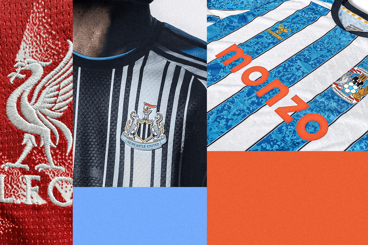
This is such a clear and literal tribute to a Liverpool kit of the past, designed to appeal to nostalgists of a certain age, that I feel like a bit of a rube falling for it. But ultimately: who cares! What a kit! It would look great even if it wasn’t a direct tribute to their shirt from 1989-1991, those white flecks and dashes on the red background making it look a bit like a decorator’s overalls… but in a good way. It’s absolutely sensational, the best Liverpool have looked in years — and they have looked pretty good. Not even the weirdly thick stripes down the shoulders that Adidas is insisting on using for all its shirts can ruin it.

Photo:

(Jan Kruger/Getty Images)

(Jan Kruger/Getty Images)

(David Rogers/Getty Images

Yes! Yes! Yes! Welcome back to the Premier League, Coventry City: you look fabulous. Those of us old enough to remember the last time Coventry were in the top flight were delighted to see them return, a rush of nostalgia flowing around us as we closed our eyes and thought about names such as Noel Whelan, Darren Huckerby and Mustapha Hadji. And the really great news is that they’re not just back, but back with the best home shirt of the season. The mottled pattern — apparently inspired by the celebrations following their victory in the 1987 FA Cup final — in the blue stripes contrasts beautifully with the white, the collar is clean and simple, and even the sponsor’s logo stands out splendidly. Superb.

Photo:

(David Rogers/Getty Images

(David Rogers/Getty Images

Connections: Sports Edition Logo

Connections: Sports Edition Logo

Connections: Sports Edition

Spot the pattern. Connect the terms

Find the hidden link between sports terms

>

Continue Reading

Sports

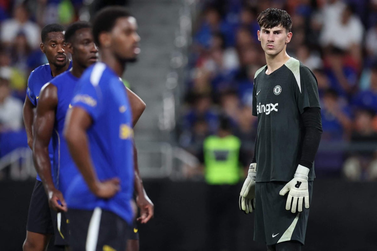
Is Mike Penders ready to become Chelsea’s starting goalkeeper?

Published

on

Xabi Alonso has made it very clear that Chelsea will not be signing a No 1 goalkeeper in this summer’s transfer window.

“I’m very happy with Rob (Sanchez), Mike (Penders) and Teddy (Sharman-Lowe),” the club’s new manager said in a press conference ahead of their pre-season match against Milan in Jakarta, Indonesia, last Saturday.

“Mike is a young goalkeeper who (had) a great season at Strasbourg (on loan for 2025-26). Rob, he has played many years in the club; in Chelsea, as well as the Premier League, he has experience. So to have this security in goal is important.”

The message, echoed in recent weeks by Chelsea sources speaking on the condition of anonymity to protect relationships, was clear: you Diogo Costa pushers, stand down.

Alonso’s team selections over the course of Chelsea’s five-game trip around Australia and East Asia have also created the expectation that Sanchez will begin his fourth season at Stamford Bridge as the starter ahead of Penders, who did not play a minute in last weekend’s double-header against Milan and Malaysian champions Johor Darul Ta’zim.

That stance will not satisfy the many Chelsea fans who have lobbied for some time to see an upgrade on the 28-year-old Spaniard, who has been benched on several occasions in the past three years and has failed to inspire much confidence among supporters, even in his better stretches of form.

Last season, Sanchez ranked eighth in the Premier League with 2.7 ‘goals prevented’ (defined by Opta as the number of goals that a goalkeeper was expected to concede as a proportion of the number of goals they actually conceded), but that relatively respectable level of performance has not translated into trust with many Chelsea followers.

Penders is positive by this metric too, ranking seventh in France’s Ligue 1 last season with 3.1 goals prevented. The previous season, his breakthrough campaign in Belgium’s top flight at Genk, yielded a total of 4.3.

Such statistics are more definitive over a much larger, multi-season sample size, but these numbers do at least give cause to believe that the 21-year-old could be a significantly better-than-average shot-stopper for Chelsea.

He already has the valuable endorsement of Christophe Lollichon, the club’s legendary former goalkeeping coach who worked with Petr Cech and Thibaut Courtois.

Lollichon saw Penders up close when his current employers, Dunkerque, faced Strasbourg in the French Cup last season and spoke to him afterwards.

Mike Penders impressed with his shot-stopping at Strasbourg last season (Sebastien Bozon/AFP via Getty Images)

“I saw a mature goalkeeper,” he said of the Belgian in an exclusive interview with The Athletic last month. “He has to improve with (the ball at) his feet, but at (his age), he’s very good. He has good positioning, he’s proactive and he wants to learn. I felt this attitude in our conversation. He asked me about the Premier League. We spoke for just 20 minutes but it was very interesting.

“This guy could be the next good one in Chelsea, because for a long time now the goalkeeper position is poor in Chelsea.”

Lollichon’s appraisal of Penders’ mindset was echoed by a Strasbourg source, who described the young Belgian as a hard worker, always eager to study video of his performances and ask the club’s coaches and analysts what he could do to improve, down to the finest technical details. That inner drive, coupled with his outgoing personality, made him well liked and respected.

Penders has just 78 senior professional league appearances to his name, however.

Cech had nearly double that figure when he arrived from French club Rennes as a 22-year-old in the summer of 2003. Courtois had been a league champion in Belgium and Spain, as well as a Champions League finalist, by the time Chelsea brought him back from three consecutive loan seasons at Atletico Madrid at that same age in 2014. So despite being only slightly older than Penders is now, both men were far more seasoned and polished.

What were football transfers like before the transfer window?

Tifo Football

None of the above means Penders is not ready to displace Sanchez sooner rather than later this season, but it does help to calibrate expectations.

“I think (competing for the No 1 spot) could be good for both of them,” says Matt Pyzdrowski, a former professional keeper and current coach who serves as goalkeeping analyst for The Athletic. “For Sanchez, it could light a fire under him that there’s a young guy who wants to learn, who’s very talented, and who will take his job if he doesn’t perform.”

Pyzdrowski likes what he saw from Penders at Strasbourg, particularly in adapting to a more expansive role in possession against a more testing level of opposition pressure.

“He’s always been a very modern goalkeeper,” he adds. “He loves playing very offensively in his position, both in the build-up and defensively. In build-up under Liam Rosenior at Strasbourg, he was playing like an inverted centre-back — very, very aggressive in his play, and he was very comfortable in that role.

“You could see his range of passing, specifically how he’s able to go, Ederson-esque, from defence to attack in a second and launch balls quite far up the field, but he’s comfortable with building out from the back as well.”

The graphic below maps Penders’ distribution in Ligue 1 last season.

His passing consisted largely of short balls out to central areas from open play, with the occasional longer hit from goal kicks when favourable circumstances presented themselves:

For the sake of comparison, below is the same breakdown for Sanchez in the Premier League last season.

It is important to note that goalkeeper distribution is always impacted by team style and tactical instructions, but the Spaniard went longer more frequently from goal kicks:

Penders’ 6ft 7in (200cm) stature and huge wingspan also make him a force to be reckoned with when high balls come into his penalty area, which should translate well to the modern, more set-piece-focused Premier League.

“You never know until they’re thrown into the deep end, they either sink or swim, but he has an incredible frame and really good timing,” Pyzdrowski says. “He reads the flight of the ball really well. It’ll be interesting to see how he handles having four or five guys surrounding him in the box, because that’s what was allowed in the Premier League last season.”

There are also some areas for Penders to continue to improve.

“He’s always been a good shot-stopper — the only reason I don’t say great is because there are a few things that he still needs to iron out,” Pyzdrowski says. “Specifically with his positioning. Sometimes he can get pulled a little bit too far towards his near post with wide shots and open up space towards the back post.

“Also, in one-v-one situations, he’s a very typical big goalkeeper in that he tries to use his frame, but he hasn’t really figured out how to control it yet. There are quite a lot of situations where he rushes out of his goal and then maybe the attacker chips him or places the shot around him. It would be better for him to be a bit more calm in his approach instead of just rushing out of his goal.

“He’s young, so this is not strange — it’s part of the development phase. If he can put the tools together, to be able to use that size with a bit more composure, he’ll be very tough to beat.”

Penders produced some hugely exciting flashes at Strasbourg. He also made some errors that would have been scrutinised far more harshly had he been playing for Chelsea. Player development is not an exact science and bringing him along at the right speed will be a delicate balancing act for Alonso, amplified by the pressure to keep piling up Premier League points.

At 6ft 7in, Penders commands his area effectively (Sebastien Bozon/AFP via Getty Images)

The good news is that Sanchez is already sounding a positive note about Penders’ arrival.

“I think it is great for him to come here,” he said in an interview with journalists including The Athletic last week. “It is great competition. He has massive potential. I think he is going to be a great goalkeeper in the future — massive.

“You need someone, another choice, to cover and push each other to elevate your level. If you do not have someone who is pushing you every day, you get lazy, and then the performance drops. I think it is always good to have one or two people pushing you every day.”

Alonso appears to be leaning towards playing Sanchez over Penders in goal when Chelsea begin their Premier League season away to west London neighbours Fulham next Monday, August 24, but Pyzdrowski is making no assumptions that the goalkeeping hierarchy will stay that way throughout the campaign.

“I would be surprised if Penders is the starter on day one, just because at his age you don’t want to rush and throw him to the wolves,” he says. “But if things don’t go well for Chelsea at the beginning of the season and Sanchez doesn’t perform, it opens the door.”

>

Continue Reading

Sports

Nine of 20 Premier League teams have changed managers. Strap in – this could be unpredictable

Published

on

Episodes of the Premier League Years, the Sky Sports show that boils down each season into two hours and is arguably the UK’s greatest cultural achievement, often begin with a montage of that season’s new arrivals.

Whoever is putting together the 2026-27 edition might want to start work now, because it could take a while.

From the start of this season, nine of the 20 Premier League clubs will have new managers. That’s the highest number in the division’s history: the next highest was eight, which came in the summer of 2016, when Pep Guardiola arrived at Manchester City, Antonio Conte took over at Chelsea and Jose Mourinho signed up for the Manchester United job.

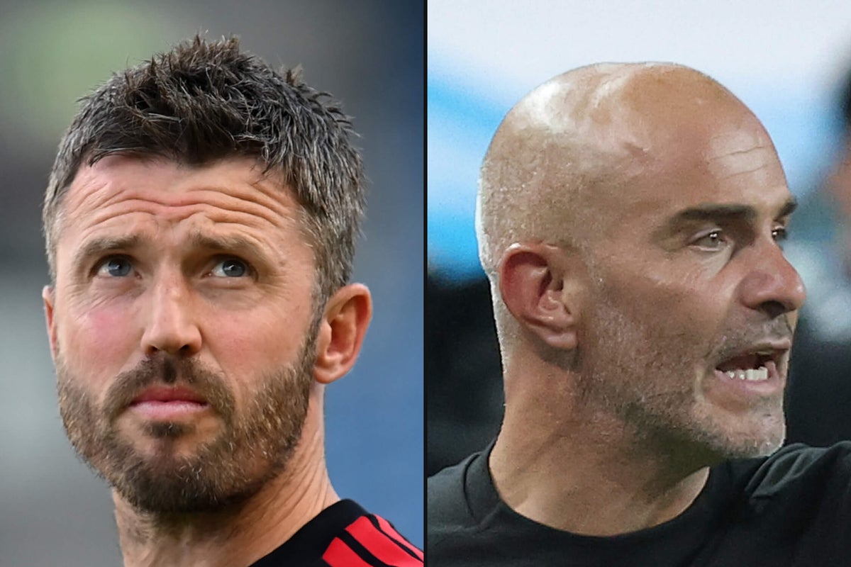
But there are even more layers this year. Two of the remaining 11 managers, Michael Carrick and Roberto De Zerbi, weren’t in charge of Manchester United and Tottenham Hotspur at the turn of the year. Ipswich Town, who have replaced Kieran McKenna with Gary O’Neil, will be the first promoted club since Hull City in 2016-17 to enter the Premier League with a different manager from the one who took them up.

Mikel Arteta and Unai Emery are the only managers who have been at their clubs for longer than three years. Regis Le Bris, who arrived at Sunderland in 2024, is the fourth longest-serving manager in the Premier League. David Moyes, whose second spell at Everton is barely 18 months old, is seventh. Bournemouth’s Marco Rose is 12th, and he has yet to take charge of a game.

Compare this to the start of last season, when the only managerial changes were Thomas Frank moving from Brentford to Tottenham Hotspur and his former side replacing him from within, appointing Keith Andrews. It didn’t take long for the chaos to begin, but 12 months ago, the outlook was steadier.

This is a season of unprecedented uncertainty, and what makes it particularly interesting is how much change there has been at the top.

Five of the ‘Big Six’ — Chelsea, Liverpool, Manchester City, Manchester United and Tottenham Hotspur — have installed a new manager since the turn of the year. Xabi Alonso (Chelsea), Andoni Iraola (Liverpool) and Enzo Maresca (Manchester City) arrived this summer, while De Zerbi arrived in April and Carrick took the United job on a temporary basis in January, made permanent in May.

Throw in Newcastle bringing in Matthias Jaissle to replace Eddie Howe, and of the seven teams that have qualified for the Champions League in the last decade, 85 per cent of them have a brand-new or relatively new manager.

And with this newness, inevitably comes a range of questions.

Will Iraola be able to translate his Bournemouth football to Liverpool? Can Carrick turn a good few months as United caretaker into a successful whole season? Will Alonso make sense of Chelsea, a squad so young that he took one look at it and immediately insisted they sign a few adults?

Maresca was hired as a sort of continuity candidate, having worked under Pep Guardiola before. But his City squad already looks very different and much less experienced, and might be even more so by the end of August: will that be a positive or a negative? De Zerbi saved Tottenham from oblivion last season but can that translate into something longer-term? And who knows about Newcastle, who have lost three crucial players and only really brought in promising youngsters, all of whom will be managed by someone recruited from the Saudi Pro League.

It’s one of the reasons that Arsenal are such clear favourites to retain their title: even though you can ask legitimate questions about their forward options, the quality of their first XI and their style of play, they are the most stable and predictable team among the contenders.

The uncertainty extends beyond the biggest clubs too. Fulham, after five seasons with Marco Silva at the helm, have brought in Alvaro Arbeloa, who spent the second half of last season in charge of Real Madrid. But those 28 games represent his only senior experience so far, and he only took charge of his first game of any description last May.

What were football transfers like before the transfer window?

Tifo Football

Nottingham Forest pulled off a coup by recruiting Oliver Glasner, but the Austrian is their fifth manager in a year: can you trust them to stick with him if early results go badly? Glasner’s replacement at Crystal Palace is Pierre Sage, who has a good record in France, but moving to a new league is fraught with uncertainty.

Kieran McKenna spent five years at Ipswich and led them to three promotions, so anyone replacing him has a tough job by definition: good luck, Gary O’Neil.

Perhaps all of this is overly negative, and the downsides of these collective risks have been overemphasised. To that point, the last time there was something close to this level of managerial churn was the 2016-17 campaign, and it worked out pretty well for some.

Of the eight new managers, only one — Mike Phelan at Hull — lost their job during the season. Chelsea won the title under Conte after finishing 10th a year earlier, in “the Mourinho season”, as he called it. With Mourinho, United finished sixth but won the League Cup and the Europa League. Guardiola’s first season at City wasn’t regarded as a huge success in relation to the rest of his time there, but they finished a place higher than in 2015-16 and won 12 more points.

Conte won the Premier League in 2016-17 (Michael Regan/Getty Images)

On the other hand, Hull were relegated, as were Sunderland, with David Moyes at the helm in his only season there, although there were factors beyond merely the identity of the manager. Watford dropped from 13th to 17th under Walter Mazzarri, and Southampton regressed two places after replacing Ronald Koeman with Claude Puel.

This season, admittedly, we probably do broadly know which teams will be nearer the top and which at the bottom. But even with that in mind, there remains so much uncertainty that it’s impossible to predict anything. Which makes it maybe the most interesting and potentially exciting season in years.

At least one of these new managers is going to flame out spectacularly. At least one of them will be out by November. At least one of them will be a roaring success. At least one of them will probably win a trophy of some nature. Maybe at least one of them will disgrace themselves in an entertaining fashion.

The thing is: we don’t really know, and not knowing is good. That’s a good feeling to enter a season with.

>

Continue Reading

Sports

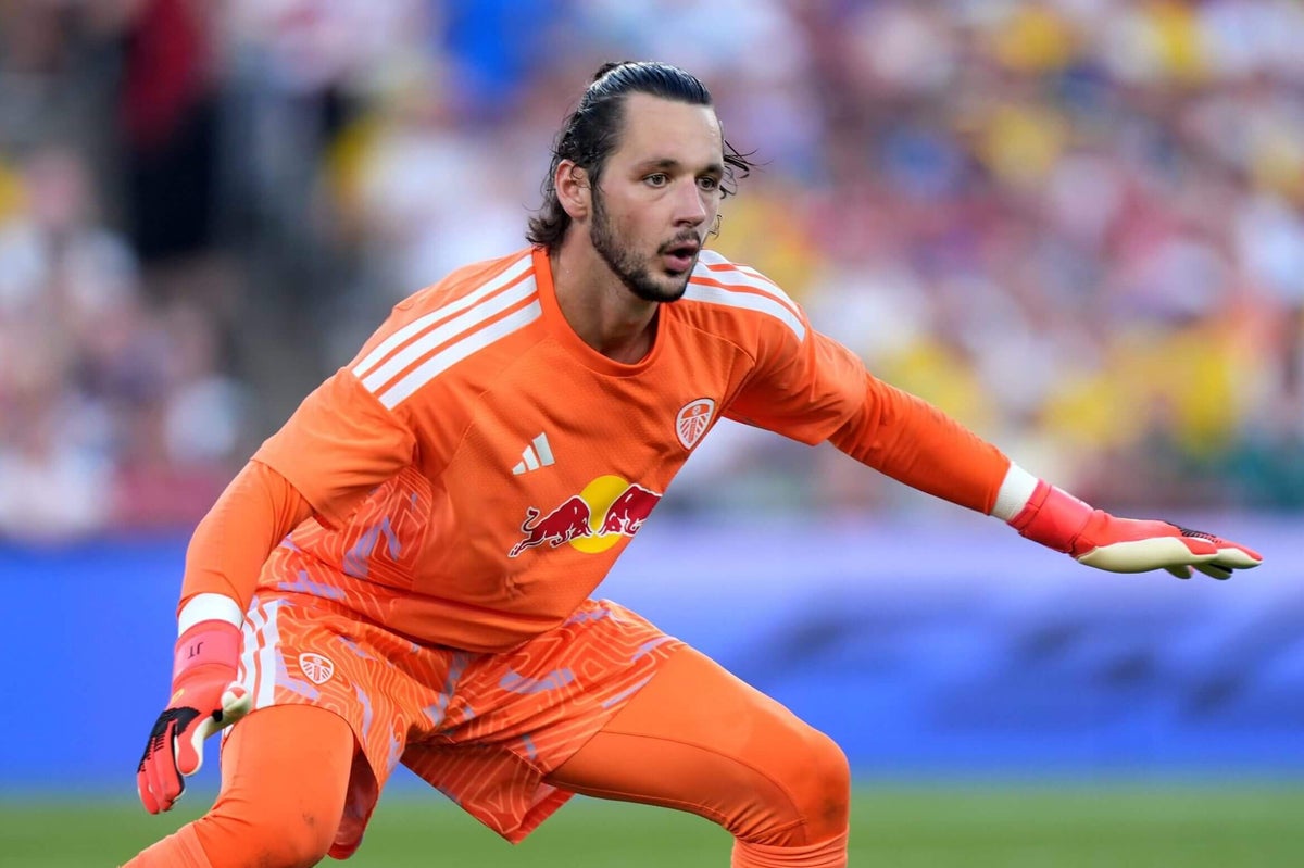
James Trafford: ‘It’s great that Leeds fans are excited. This is the right move for me’

Published

on

The excitement is cutting through to James Trafford. Leeds United’s goalkeeper does not manage his social media accounts but his friends have kept him informed of the feverish reaction to his arrival.

Forty-five minutes in front of a Croke Park terrace rammed with Leeds supporters, less than a week after becoming the club’s most expensive transfer in history, also gave him an unsubtle insight into the reaction. This club is everywhere, he’s discovered.

“Everyone seems to be a Leeds fan,” he told reporters, including The Athletic, on Friday. “That’s what I figured out.

“I don’t run my social media but my mates tell me there’s a lot of Leeds fans, and they’re all really excited. It’s amazing. Everyone wears Leeds tops (in the city). The only tops you really see — maybe I’ll notice it now — are Leeds tops.”

Trafford, 23, is an immensely level-headed individual. Every answer he gives boils down to a very sensible point of view: he loves playing football, he’s looking forward to doing it with Leeds and there’s nothing he can do about his price tag.

When a club spends an initial £40million ($54.1m) on a goalkeeper, the most ever spent on a British stopper, there is a certain level of anticipation and expectation attached to the player in question. Trafford acknowledges those hopes, but knows it’s not something he can focus on.

“I can’t control any of that,” he said. “I just want to go play football and work as hard as I can, and enjoy it as much as I can.

“People can be excited. It’s brilliant they’re excited and we want to win games of football.”

James Trafford hugs Erling Haaland during England's meeting with Norway at the World Cup

Trafford, left, shares a joke with his then-Manchester City team-mate Erling Haaland during the World Cup (Roberto Schmidt/AFP via Getty Images)

The former Manchester City man also does not think it’s especially about him, personally. Trafford suspects the next new signing at Leeds will generate the same kind of excitement, the next dopamine hit.

“It’s brilliant they’re (Leeds fans) excited,” he said. “Any new signing they’d be excited about because it’s just the nature of the world we live in. Everyone always wants the next thing but yes, it’s brilliant they’re excited and I can’t wait to play in front of them all again.”

Trafford, who travelled with England to the World Cup, was available this summer because he was Manchester City’s backup stopper. In interviews, he did not hide his disappointment at sitting out much of the Premier League season.

However, as he said on Friday, he took a lot from being the man between the sticks as City won the FA Cup and Carabao Cup. It showed him the power of persistence.

“It’s a very long season at City because there are so many games, so much travelling,” he said. “Some days were really tough and some days were really, really good.

“It’s just about balancing the emotions and learning from it because it was a totally new experience for me. The first half of the season was a lot harder because the games weren’t so frequent I was playing (in).

“From January to the end of the season, we had a lot of big games. We played Newcastle, or we played Liverpool, Arsenal, Chelsea.

“We had big games and we were getting closer to winning a trophy. To win the two trophies was a brilliant end to a very tough season because it rewarded me for never giving up.

“It was a season I look back on as a positive season. I learned a lot and got better.”

A goalkeeper of Trafford’s standing was never going to be short of transfer options, yet he believes he has found the correct landing spot.

“It’s the best move for me at this stage in my career and for all the dreams and things I want to achieve,” he said. “This is the thing that puts me in the best stead to achieve all those dreams, and I can’t wait.

James Trafford makes a save from Arsenal's Kai Havertz during March's Carabao Cup final

Trafford impressed in City’s win over Arsenal in March’s Carabao Cup final (Julian Finney/Getty Images)

“The staff are always wanting to improve. It’s a really good squad that can always improve, and it’s a club that’s just always trying to improve. When everyone’s trying to move in the same direction and are moving, then you’re always going to grow, so that’s the main thing.”

Elland Road is the next box to tick off on his list as a Leeds player. He will almost certainly feature in the final pre-season friendly against Augsburg today (Saturday).

It won’t be his first time there, however. He faced Daniel Farke’s team in September 2024, when Burnley and Leeds went head-to-head for the Championship crown.

True to his form across that entire campaign (16 goals conceded in 45 appearances in that 2024-25 season), he kept a clean sheet.

“It’ll be a lot better playing with the fans than against the fans,” he said. “They’re honestly very, very good. They make Elland Road extremely tough and they improve us as a team, which is the main thing. We’re all really excited to be back in front of them again.”

>

Continue Reading

Trending

Copyright © 2017 Zox News Theme. Theme by MVP Themes, powered by WordPress.