Connect with us

Sports

Ranking every 2026-27 Premier League home kit: Perfect pinstripes, a horror sponsor and one just like the sweater from Friends

Published

on

We’ve had at least two weeks without football, but now that barren, arid desert of nothingness is over and the new Premier League season is very nearly upon us.

And what better signpost for the coming campaign than the return of our traditional kit rankings. So roll up, roll up for your thoughts and opinions on the garms that your club will be wearing in home matches over the next 10 months.

Which shirt looks like a prop from Friends? Which is the equivalent of Homer Simpson backing into the hedge? And which new arrival comes out on top…?


(Clive Brunskill/Getty Images)

Do you think that in their heart of hearts, in the cold light of day when they consider their work, even the person at Adidas who designed this shirt thinks it looks good? The blurb says it pays homage to their shirt from the start of the 1990s but that looked stupid and this one does too. You can see why they have tried something like this: a bit of variety is worth a go and it’s not a terrible idea to try a bit of extra colour, but it looks abysmal and there’s a solid chance that anyone who runs a bit too quickly wearing this will strobe as they go past you.

Photo:

(Clive Brunskill/Getty Images)

(Clive Brunskill/Getty Images)

(Edmund So/Eurasia Sport Images/Getty Images)

Well, if nothing else this puts paid to the automatic assumption that kits automatically look great without a sponsor. What’s going on here? It’s not true to suggest that this looks like a dodgy, knock-off kit you’d find on a market somewhere because these days, those all look pretty convincing. This looks like a dodgy, knock-off kit you’d find on a market somewhere about 20 years ago, somewhere far away and before the internet could tell you what the actual Chelsea kit is like. Despite the extensive and occasionally bizarre promotional campaign (hello Madonna and Gymskin dancing together, for some reason), the shirt is simply no good.

Photo:

(Edmund So/Eurasia Sport Images/Getty Images)

(Edmund So/Eurasia Sport Images/Getty Images)

(Chung Sung-Jun/Getty Images)

Hmmm. This ‘colour fades into a different one at the waist’ thing looked weird when Manchester United did it with red and black a few years ago, and it looks weird for City with blue and white now. Puma is at least using the right shade of blue for City and the white trim on the collar, cuffs and underneath the armpits works quite nicely… if only they hadn’t spoiled it with the fading thing. It’s the football shirt equivalent of Homer backing into the hedge.

Photo:

(Chung Sung-Jun/Getty Images)

(Chung Sung-Jun/Getty Images)

(Tony King/Getty Images)

This is a slightly curious case, because it looks exactly like a shirt that Toffs — the company that produced reproductions of very old shirts from the early 1900s and beyond — would have put out. That’s partly because it sort of is: the shirt is inspired by Hull shirts from the 1970s, even to the extent of using their old badge rather than the one with the tiger that we’re mostly familiar with. It’s quite jarring: on the one hand it’s unusual and thus stands out, but on the other, it doesn’t look like a shirt a team in 2026 should be wearing and you get the strong sense that their players will just look like a bunch of 40-year-old dads playing five-a-side at their local Powerleague.

Photo:

(Tony King/Getty Images)

(Tony King/Getty Images)

(Paul Bonser/SOPA Images/LightRocket via Getty Images

Forest may have goofed slightly this summer after releasing a collaboration with Adidas Originals that looks like a home shirt, isn’t a home shirt, but everyone seems to prefer it to the home shirt. The Originals collaboration is wonderfully clean and classic, whereas this home shirt looks like someone has just been down the gym in it, sweated profusely, then passed it on to the players before a game. Actually, you know what else it looks like: that episode of Friends where they’re trying to work out who the father of Rachel’s baby is and they narrow it down to the owner of a red, mottled jumper: it looks like that jumper. Good I suppose, if you’re a huge Friends (or sweat) fan, but if not…

Photo:

(Paul Bonser/SOPA Images/LightRocket via Getty Images

(Paul Bonser/SOPA Images/LightRocket via Getty Images

(Gabriel Colchero/Quality Sport Images/Getty Images)

Hmmm, yes. A great example of how a sponsor’s logo can wreck an an otherwise perfectly decent shirt. The Vitality logo is slapped onto the torso in such a way that it looks a bit like a “60 per cent off’ sticker on some soon-to-go-out-of-date supermarket chicken. It’s also slightly jarring that there’s a black ring around the pink circle of the logo, presumably to ensure it stands out better than it would against the red stripes: we’re all grown up enough to realise that football clubs do bend to their sponsors, but it still feels slightly icky that their shirt design has to adapt to the people paying the bills, rather than the other way around. It’s a shame because the background pattern on the red stripes depicts the club’s original logo from the 1930s, which would have been a really nice touch were it not for the big pink distraction.

Photo:

(Gabriel Colchero/Quality Sport Images/Getty Images)

(Gabriel Colchero/Quality Sport Images/Getty Images)

(George Wood/Getty Images)

Roll up for some top-drawer kit sales nonsense from Adidas, which reports that: “Marking the 400th anniversary of the Leeds town charter, the Leeds United 26/27 Home Jersey is a bold tribute to the city’s enduring football culture.” O… K. It just looks like a white shirt with some horizontal blue and yellow pinstripes to us, but what do we know? This has clearly been a bit of a contentious one and you can understand why: stripped of context, it looks pretty nice, but take the badge off and you’d have difficulty identifying it as a Leeds shirt. These things matter: if you subscribe to the old Jerry Seinfeld line about sports fandom essentially boils down to “cheering laundry”, given everything else about these clubs is transient, it does mean something for a team to look distinct.

Photo:

(George Wood/Getty Images)

(George Wood/Getty Images)

(Sebastian Frej/Getty Images)

There’s something slightly strange going on here, in that you look at this Fulham shirt and you’re convinced that they’ve had this design a few times before. Which they sort of have: it’s pretty similar to their 2022-23 home shirt and pretty similar to a few others too. Perhaps this is just a consequence of having a black and white home shirt but there are ways of jazzing these things up. For the most part, most semi-obsessed football fans could look at a shirt and pretty well identify the season it belongs to, but in a few years, you’d probably struggle with this one.

Photo:

(Sebastian Frej/Getty Images)

(Sebastian Frej/Getty Images)

(Pakawich Damrongkiattisak/Getty Images)

It’s not automatically a bad thing when a club diverts from their traditional kit design to try something new but when they do it, you’d prefer them to come up with something interesting or radical. This isn’t the first time that Villa have strayed from the classic ‘claret body, light blue sleeves’ combo but most of the previous times, it’s been a bit more of a departure, notably the thick-striped effort from the late 1990s that clad the Paul Merson/Dion Dublin/Ugo Ehiogu team. This is just… a shirt. It’s fine — clean, simple, no frills — but it’s just… a shirt. The blurb boasts that it “draws inspiration from Villa’s most unconventional kits”, which they could argue is technically true given it’s unconventional for them, but it’s still… a shirt. It feels like the equivalent of someone saying “I know this is a controversial opinion, right, but…” before announcing that they like cheese.

Photo:

(Pakawich Damrongkiattisak/Getty Images)

(Pakawich Damrongkiattisak/Getty Images)

(Christian Kaspar-Bartke/Getty Images)

Just the wrong side of the ‘is it clean and simple or is it boring and unimaginative?’ line. Just, mind you: it’s not terrible and the restrained dashes of yellow that occasionally make an appearance on Everton shirts are always welcome. Castore’s sell for this one is that the design draws “inspiration from marine flags found at the city’s docks” and that the shirt “brings a fresh twist to a nostalgic source of inspiration”. Which isn’t entirely untrue but you have to squint pretty hard to actually see those marine flags, which renders it all partly pointless.

Photo:

(Christian Kaspar-Bartke/Getty Images)

(Christian Kaspar-Bartke/Getty Images)

(Claudio Villa/Getty Images)

A divergence from convention like this is always going to be a room-splitter but at the very least you have to take your hats off to Crystal Palace and Macron for trying something different that nonetheless has some grounding in the club, a connection to their past. Palace have dabbled with the sash/mainly white shirts with blue-and-red trim combo a number of times with their away kits, but there was a time, mainly the 1970s and 1980s, when this theme was their default. However, while the concept is strong, there is a sense that the execution doesn’t quite live up to it. It’s just a bit… busy: the sash is a bit too wide and the bars on the shoulders are far too big. They are awarded points for the return of their circular request but in summary, this is a flawed, if admirable effort.

Photo:

(Claudio Villa/Getty Images)

(Claudio Villa/Getty Images)

(Phil Walter/Getty Images)

“Set on the club’s classic white, the shirt features sharper, faster and more cutting-edge visuals than ever before” — so claims the Nike blurb, which is… well, do you think even they believe it? This is just a white shirt with a couple of blue bits dabbed here and there, and some strange slashing patterns on the background that you can’t really see if you’re more than a few yards away. It looks fine and those cuffs are actually quite nice, but it’s not sharp, fast or cutting edge.

Photo:

(Phil Walter/Getty Images)

(Phil Walter/Getty Images)

(Brentford FC)

Very nice. In case you’re wondering why the colour on the collar and cuffs is ‘honey yellow’… because they’re the Bees! It is genuinely quite a nice touch to introduce a fresh colour to a shirt without it being something random, and you wonder why they haven’t thought of it before given the yellow has always been there since they changed their badge to incorporate the bee back in 2017. Joma isn’t known for producing the best-looking kits but this is a big improvement on the last two seasons (Brentford are again sticking two fingers to modern consumerism and retaining this new home shirt, like the previous one, for two seasons rather than one).

(Brentford FC)

(Justin Setterfield/Getty Images)

This feels like a bit of a halfway house between recent Arsenal kits, which have stuck with the classic configuration of having a red body with white sleeves, the main point of difference being the colour of the three Adidas stripes. They’ve previously had white, gold, dark blue and, last season red, so this time they’ve gone for… two types of red. It does look slightly weird not having all three stripes as the same colour, almost as if — and this is clearly not actually true — they forgot to order enough dark stripes, so had to whack some old lighter ones on to make up the numbers. That aside, this is a perfectly nice shirt, the other variance coming on the collar and trim, which is apparently inspired by the architecture of the Emirates to celebrate 20 years at the stadium.

Photo:

(Justin Setterfield/Getty Images)

(Justin Setterfield/Getty Images)

(Steve Bardens/Getty Images)

A bit of a departure, but a good one. This shirt references the kit Brighton wore in the 1983 FA Cup final, a slightly random tribute given they are celebrating the, erm, 43rd anniversary of that achievement, but an aesthetically pleasing one nonetheless. The broken pinstripes are a nice touch and while it’s not the first time they have tried something like this (see their 2020-21 home kit), it will look a bit different this time as they’ve gone with blue shorts, rather than white. It looks good, but will they look like Brighton?

Photo:

(Steve Bardens/Getty Images)

(Steve Bardens/Getty Images)

(Justin Setterfield/Getty Images)

Very good. You do start to worry that kit designers are running out of ideas when they cite the configuration of the floodlights at a stadium as an inspiration for their shirts, but when it results in as pleasing a design as this, then it doesn’t really matter. If you’re quibbling, you could probably do without the black parts of the trim and just leave the white to pop a little more, but we’re firmly into nit-picking territory here.

Photo:

(Justin Setterfield/Getty Images)

(Justin Setterfield/Getty Images)

(Dustin Satloff/Getty Images)

Plenty of clubs go retro but Sunderland have reeeeeallllly gone retro with this one, their 2026-27 home kit being a tribute to their shirt from… 1937, when they won the FA Cup for the first time. And not just that this apes the design but look closely and you’ll see an ’S’- shaped design all over the shirt, which are actually reproductions of the FA Cup handles. And inside the collar, they have stitched the names of their players from that game. That link to the past is great but even if it wasn’t there, then this looks pretty nice — fairly basic when you look at it from a distance but with more to it when you zoom in.

Photo:

(Dustin Satloff/Getty Images)

(Dustin Satloff/Getty Images)

(David Lidstrom/Getty Images)

Now this is a proper Manchester United shirt, and I’ll tell you why: they have nailed the correct colour proportions for a United shirt. You want the main body to be red, obviously, then you want the trim to be white and you want the secondary trim — about a third of the area covered by the white — to be black. And that’s exactly what we’ve got here, with the Adidas stripes in white but the black making sparing appearances on the collar and cuffs. The blurb says it’s inspired by United’s shirts from the mid-1970s, but it’s also reminiscent of their shirt from 1990 just with a collar. Very good.

Photo:

(David Lidstrom/Getty Images)

(David Lidstrom/Getty Images)

(Jan Kruger/Getty Images)

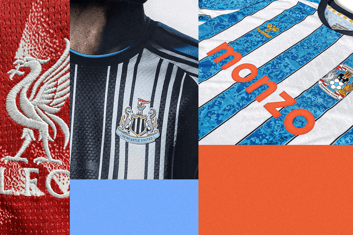
This is such a clear and literal tribute to a Liverpool kit of the past, designed to appeal to nostalgists of a certain age, that I feel like a bit of a rube falling for it. But ultimately: who cares! What a kit! It would look great even if it wasn’t a direct tribute to their shirt from 1989-1991, those white flecks and dashes on the red background making it look a bit like a decorator’s overalls… but in a good way. It’s absolutely sensational, the best Liverpool have looked in years — and they have looked pretty good. Not even the weirdly thick stripes down the shoulders that Adidas is insisting on using for all its shirts can ruin it.

Photo:

(Jan Kruger/Getty Images)

(Jan Kruger/Getty Images)

(David Rogers/Getty Images

Yes! Yes! Yes! Welcome back to the Premier League, Coventry City: you look fabulous. Those of us old enough to remember the last time Coventry were in the top flight were delighted to see them return, a rush of nostalgia flowing around us as we closed our eyes and thought about names such as Noel Whelan, Darren Huckerby and Mustapha Hadji. And the really great news is that they’re not just back, but back with the best home shirt of the season. The mottled pattern — apparently inspired by the celebrations following their victory in the 1987 FA Cup final — in the blue stripes contrasts beautifully with the white, the collar is clean and simple, and even the sponsor’s logo stands out splendidly. Superb.

Photo:

(David Rogers/Getty Images

(David Rogers/Getty Images

Connections: Sports Edition Logo

Connections: Sports Edition Logo

Connections: Sports Edition

Spot the pattern. Connect the terms

Find the hidden link between sports terms

>

Continue Reading

Sports

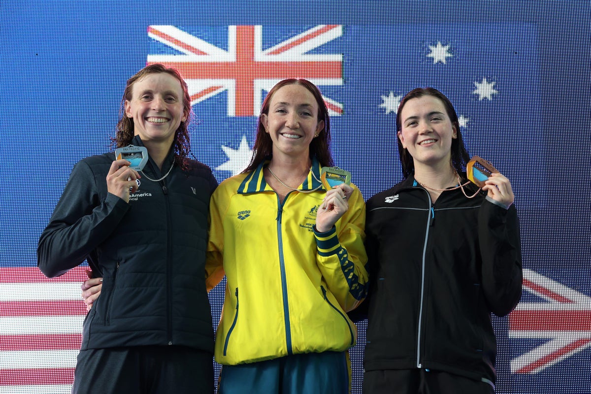
Australia’s Lani Pallister holds off Katie Ledecky in 400 freestyle showdown

Published

on

IRVINE, Calif. — On Lani Pallister’s left arm, just below her wrist, she has a tattoo that reads “Hope is not a strategy.” The 24-year-old developed that outlook after a trying 2021. On top of missing the team for that year’s Olympics, she underwent a heart procedure and battled an eating disorder.

“I kind of just hoped everything would work itself out,” said the Australian, who went on to win a 4×200-meter freestyle relay gold at the 2024 Olympics. “It wasn’t until I kind of sat down and talked to my psych and the network around me and actually talked about all the things that had kind of gone wrong that (I realized) it’s not a strategy to just kind of coast through life.

“That year taught me a lot in resilience, and it’s definitely made me who I am now.”

Who she is now is one of the best swimmers in the world, one who looks as if she’ll be a major factor at the 2028 Olympics. Her breakout continued Friday at the Pan Pacific Championships, one of the biggest international meets of the year. She held off Katie Ledecky in the 400 freestyle, posting a personal-best and 2026 world-leading time (3 minutes, 58.42 seconds) and winning her fourth medal of the meet, her third gold.

After her morning swim, Pallister called the 400 an event she’s “still trying to figure out” and mentioned being tired of repeatedly seeing 3:59 on the clock after touching the wall. She dipped below it Friday, dripping below her entry time of 3:58.87.

That didn’t quite satisfy her.

“I would’ve liked (3:57), but I think as athletes you always want more,” she said, adding she wanted personal bests this week and is pleased she got them in the 400 and 1,500 freestyles and came within two-hundredths of a second of another in her 200. She has one more individual event left: the 800 freestyle Saturday, which will include another showdown with Ledecky.

The 400 freestyle was one of the most anticipated events of the meet, in part because of the potential showdown of Pallister, Ledecky and Canadian star Summer McIntosh. The final, though, did not include McIntosh, who holds the world record (3:54.18). The four-time Olympic medalist took her preliminary heat too easy and got out-touched by Yaqi Fan, a mistake she said “will never happen again.”

So it was only Ledecky and Pallister — the greatest distance swimmer ever against an ascending one who grew up idolizing her. A decade ago, Ledecky signed an autograph for Pallister, then 14, inscribing it with “Dream big!” On Friday, Pallister led wire to wire, a testament not only to the level she’s swimming at but also a reminder of the rest of the world’s best catching up to the once-infallible Ledecky.

Ledecky, winner of 14 Olympic medals, including nine golds, felt she didn’t start the race quickly enough and wasn’t happy to finish over 4 minutes. She also raved about Pallister, who won two individual medals at the 2025 World Championships.

“She has such great range,” Ledecky said. “It’s just great to have her in all these races and continue to push this sport forward.”

Said Pallister: “To be able to have someone as dominant and successful as her also be cheering and being excited for everyone else’s success is just a testament to who she is, and I think it’s a big reason why the whole world is a fan of Katie.”

Pallister’s performance this week, which comes on the heels of her winning five medals at the Commonwealth Games, has jumped out to her Australian teammates. Matthew Temple said her performance (as well as countryman Sam Short’s in the men’s 400) served as motivation heading into his 100 butterfly win. Short affectionately referred to her as “an animal.”

Pallister called racing “honestly my favorite thing” and said that’s been the case since she was young. Growing up in Sydney, she competed with her brother over everything, whether it was who could eat cereal fastest to who beat the other running home from the beach. That fire makes for a potent combination with her swimming roots. Her mother (and former coach), Janelle Pallister, swam at the 1988 Olympics and won three medals at the Commonwealth Games two years later.

The younger Pallister credited Janelle with never forcing her into the sport and stressing the need to have fun.

“I was often compared to my mom and my mum’s career, and I think she taught me a lot of humility and also how to deal with external pressure really young,” Pallister said. “She pretty much had the playbook to success for me. She’s done everything that I have, just 32 years prior.”

Well, not quite everything. This level of success — the toppling of world record-holders and the quantity of international medals — is new to the family. Pallister’s process, not relying on hope as a strategy, is working.

Other Day 3 Pan Pac notes

• The U.S. women set an American record in the 4×100 freestyle relay, highlighted by Kate Douglass’ leadoff split. She blasted a 51.69, only one-hundredth of a second off Marrit Steenbergen’s individual world record in the 100 freestyle. Douglass opted not to race the individual 100, instead swimming the 100 breaststroke Thursday. She finished fourth in that event.

“My goal was to break the world record,” the 24-year-old said. “It hurts to break the world record. It hurts to be so close to it and not get it, but I’m still really happy with that swim. Obviously that’s a huge best time for me, so I can’t be upset about it.”

Douglass, who trains at the University of Virginia, is one of the world’s most versatile swimmers. She said she plans to double in the 50 freestyle and 200 breaststroke Saturday, the final day of the meet.

• Regan Smith posted a monster preliminary heat time in the 200 backstroke, going 2:04.13, within a second of Kaylee McKeown’s world record (2:03.14).

The 24-year-old, an eight-time Olympic medalist who trains at University of Texas, was unhappy with her 100 backstroke Wednesday — “That was just not the type of swimmer that I like to think that I am,” she told reporters Friday morning — which she said left a chip on her shoulder for the 200.

“I know people have had their opinions about my performance and my teammates’ performances,” she said after the preliminaries. “Hope that shut ’em up for the morning.”

Smith was slower in the evening but still won gold in 2:05.57 but said she was psyched with the day on the whole.

“I think it was more about this morning, and this morning felt like a really great setup swim,” she said.

• The U.S. and Australia won four golds Friday, and Japan and China each won one.

>

Continue Reading

Sports

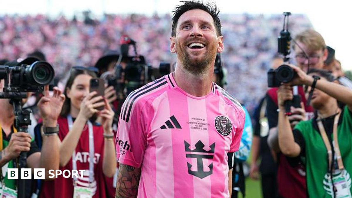
Messi, Ronaldo, Haaland: Are fans now more invested in star names than clubs?

Published

on

The game has changed quickly.

It was the summer of 2018, days before France kicked off their World Cup-winning campaign that Antoine Griezmann laid out his plans for the big reveal.

‘The Decision’, he teased, would come at the end of a half-hour documentary broadcast on Spanish TV. Barcelona thought they had him, as did most fans when Gerard Pique – whose company produced the show – tweeted a popcorn emoji.

At the end of the documentary, however, Griezmann stood in front of the Metropolitano and revealed he was staying at Atletico Madrid in one of two different endings reportedly filmed to keep the decision secret.

The self-confessed NBA fanatic – inspired by LeBron James’ live show by the same name in 2010, when the basketball star joined the Miami Heat – was attempting to own his narrative. Instead he, and Pique, caught some criticism.

Kyle says that “self-commercialisation” did not have the impact it would have done now if it was Erling Haaland or Kylian Mbappe.

Griezmann was almost before his time. Many prominent players now share regular updates from their lives on their own YouTube channels – from Haaland, to Ronaldo, Jude Bellingham and Lionesses’ star Ella Toone.

“Players are becoming their own distribution levers, with some in particular taking a driving seat in terms of ‘how I project myself onto the world’ and building their own channels and audience,” explains Kyle.

Now, in many cases, the players do own the narrative and fans are increasingly able to invest in their journeys, which are more accessible than ever.

“Players are far more culturally symbolic than they used to be,” says Kirkham. “It is not that players don’t do endorsements now, but they know they have to resonate with fans, so fans can really latch on to them and get behind them.

“Look at what Marcus Rashford did during Covid in terms of changing actual legislation.

“Young fans want to know players stand for something more – that gives them more chance to follow and pursue them, find a deeper connection with them.

“They look for stuff that is aligned to them, who they are, their causes and where they’re from. I think we will increasingly see that.”

>

Continue Reading

Sports

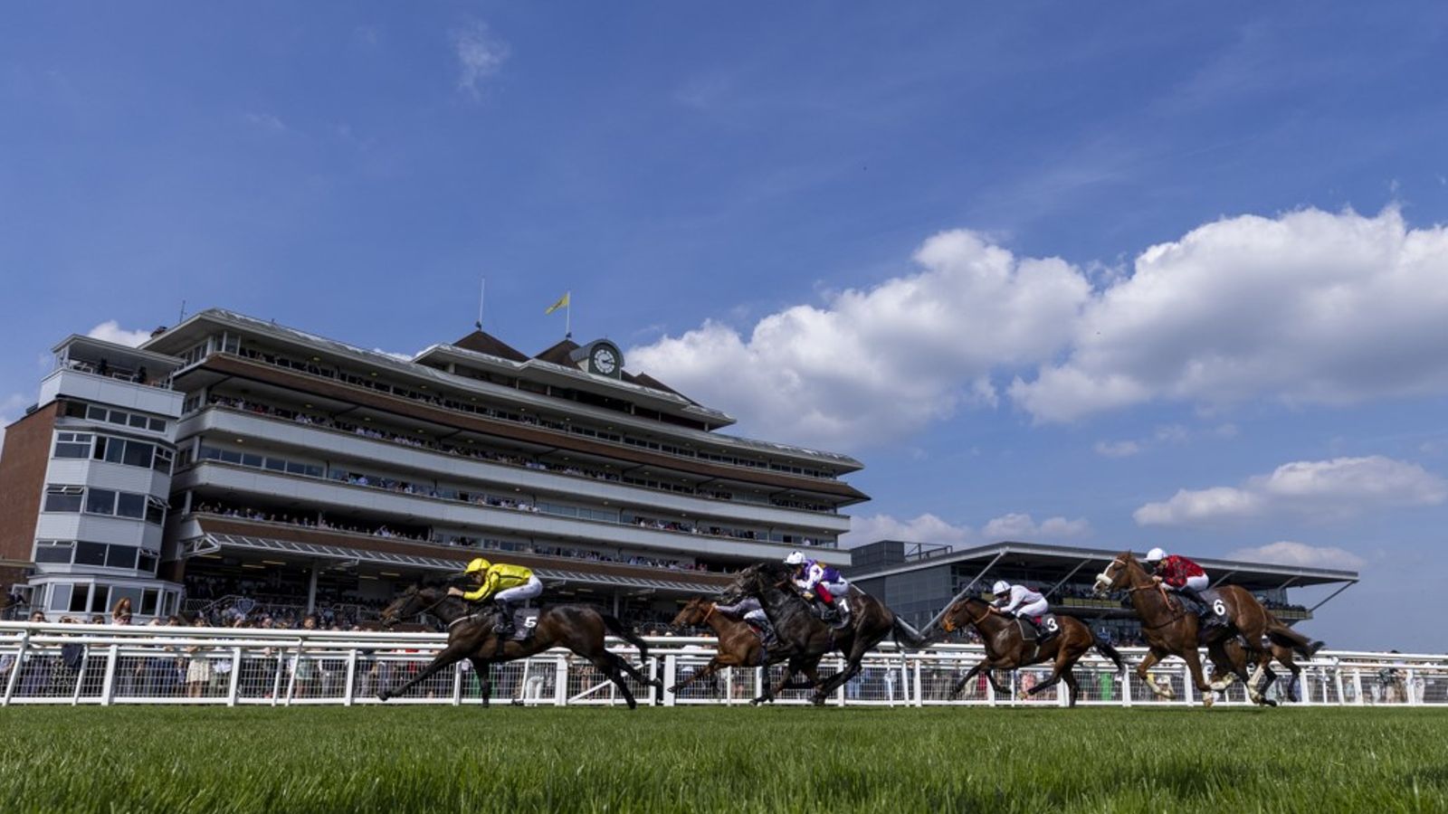
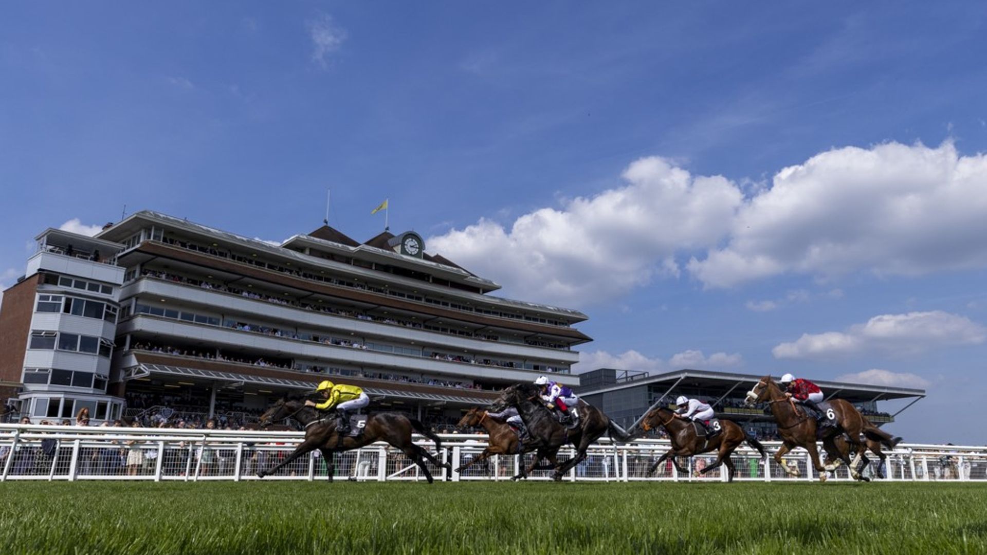
Today on Sky Sports Racing: Deauville, Doncaster, Lingfield, Newbury and Ripon | Racing News

Published

on

We have a busy day’s racing on Saturday with flat action from Deauville, Doncaster, Lingfield, Newbury and Ripon, live on Sky Sports Racing…

3.10 Newbury – Group Two Hungerford Stakes – Never So Brave and Coppull head competitive feature

Never So Brave and Coppull head a very competitive feature Visit Malta Hungerford Stakes at Newbury this afternoon.

Never So Brave holds the strongest form, having enjoyed a fruitful campaign last year, with wins in the Buckingham Palace Stakes at Royal Ascot, the Summer Mile and then topped off his season with success in the City Of York. Andrew Balding’s gelding is nought from four this year but has been keeping good company and far from disgraced himself in the Sussex Stakes last time out. Bold bid expected.

Coppull is still lightly raced and produced a career best last time out in the July Cup where he came home strongly to finish a narrowly beaten fourth of 11. He steps up to seven-furlongs for the first time today and there could yet be more to come.

Like Coppull, Symbol Of Honour is stepping up in trip and hasn’t been seen over this trip since his first start as a three-year-old. He has a fine record at Newbury, winning here on both starts and most notably last time out in the Group Three Hackwood Stakes.

William Haggas sends Extremely Zain went into the International Handicap at Ascot unbeaten and was a short-priced favourite to continue his winning sequence, however he could only manage fourth. He remains very unexposed and could take another step forward here.

1.25 Newbury- Group Three Geoffrey Freer Stakes – Dubai Honour returns to take on five rivals

Dubai Honour takes on five rivals as he returns in our opening race at Newbury today, the Highclere Thoroughbred Racing Geoffrey Freer Stakes.

This gelding is a credit to William Haggas and connections having won 12 races from 37 starts, winning four Group Ones and accruing over £5 million in earnings. We last saw him back in April when he finished a credible fourth in the Group One Queen Elizabeth Stakes at Randwick.

Mount Atlas and Tabletalk represent worthy adversaries and are set to clash for a fourth time. Mount Atlas, has got the better of his old foe on two of the three occasions that they’ve bumped heads but is three pounds worse off at the weights here having outbattled Tabletalk in a gripping finish to the John Smith’s Silver Cup.

Gamrai remains unexposed after being pipped to the Copper Horse Stakes at Royal Ascot. He has since been bought by Victorious Forever, duly switching yards to George Scott from John and Thady Gosden and there could be plenty of improvement left in the tank.

Rebel Rocket is the only three-year-old in the field and takes the step up in trip on his fourth start after last being seen finishing sixth in the Derby. He is of interest.

3.25 Ripon – Great St Wilfrid – Fast Track Harry, Lord Roxby and Dark Cloud Rising clash

Fast Track Harry, Lord Roxby and Dark Cloud Rising all clash in what looks to be a typically open renewal of the William Hill/MND Association Great St Wilfrid Handicap.

Clive Cox sends just his second runner in the last five years to the ‘Garden Racecourse’ this afternoon and could have a winning chance with Fast Track Harry who arrives here after a fine run behind Amazing Journey, who went on to win the International Handicap on King George Day. Having already won off of this mark of 95, he rates a danger to all.

Lord Roxby arrives here off the back of a course and distance success where he saw off the reopposing Dark Cloud Rising in convincing fashion. Both hold good claims here with the David O’Meara runner four-pounds better off at the weights, with a win over the track and trip of his own, and bids for a fourth win in the coveted contest for his handler.

Best of the rest

12.45 Deauville – Group Two Prix Alec Head – Rabbit’s Foot returns having not been seen since June where she beat recent Group One scorer Tiffany.

1.33 Deauville – Group Two Prix Guillaume d’Ornano – Daryzan and Montreal lock horns in a fascinating affair.

1.45 Ripon – Restricted Class Two novice, £15,462 to the winner.

2.35 Newbury – Unexposed Scoville dropped two-pounds in valuable race.

2.55 Ripon – Go Vince Go and Educating Rita clash in the Silver Cup.

3.25 Deauville – Group Three Prix de Lieurey Narissa, The Prettiest Star and Esna all feature.

3.42 Newbury – Arabian Force, Sea The Casper and Golden Story’s half-brother debuts.

3.55 Ripon – Ralph Beckett sends hat-trick seeker Swiped.

4.00 Deauville – Group Three Prix Gontaut-Biron Leffard and Cualificar take on the likes of Map Of Stars, Wimbledon Hawkeye and First Look.

10.06 Saratoga – Grade One Christophe Clement Turf Stakes Ancient Egypt and Survie clash.

>

Continue Reading

Trending

Copyright © 2017 Zox News Theme. Theme by MVP Themes, powered by WordPress.